Seaborn library has matplotlib at its core for data point visualizations. This library gives highly statistical informative graphics functionality to Seaborn.
Basic plots with Seaborn

Table of Contents
Matplotlib is at the heart of Seaborn Library’s data point visualizations. This library gives highly statistically informative graphics functionality to Seaborn.
Installation
Following are short instructions for installing seaborn.
# command prompt
pip install seaborn
# jupyter lab / collab
!pip install seaborn
You can use these commands on the command prompt. Use the same command on Jupyter or Collab in the code cell.
Importing
While importing Seaborn, you should also import the Matplotlib and pyplot objects for visualizing the plots. In the following image, we import seaborn, numpy, and pandas for visualizations, mathematical functions, and dataset handling.
import pandas as pd
import numpy as np
import seaborn as sns
import matplotlib.pyplot as plt
KDE plots with Distribution Densities
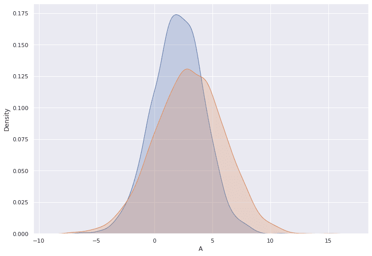
KDE plots are used to show the data distribution. In the following code, we use artificially produced data to plot with KDE.
Distplot
Distplot can help with observing histograms with trend lines. Distplot is useful for studying continuous data.
sns.set(rc={'figure.figsize':(11.7,8.27)})
sns.distplot(data['A']);
sns.distplot(data['B']);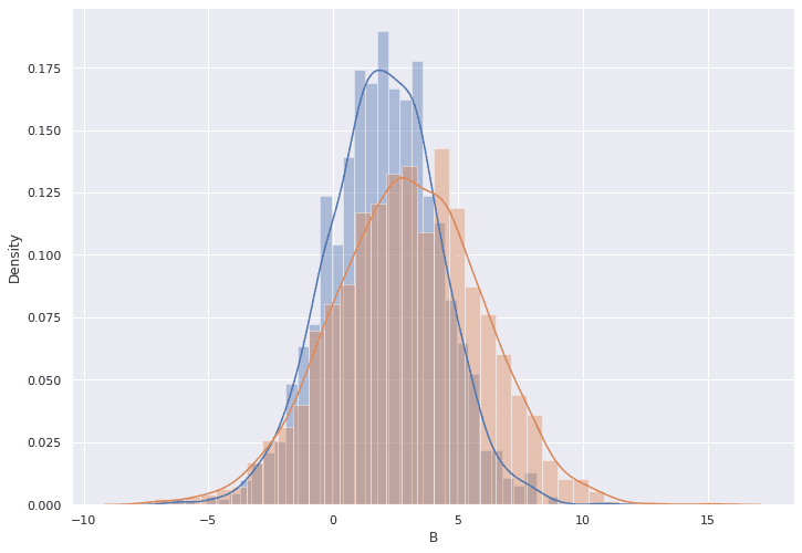
KDE plot 2D
We can also plot the data with KDE with a 2-factor distribution plot.
sns.kdeplot(x=data['A'], y=data['B'])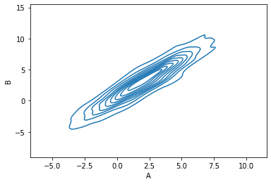
with sns.axes_style('white'):
    sns.jointplot("A", "B", data, kind='kde');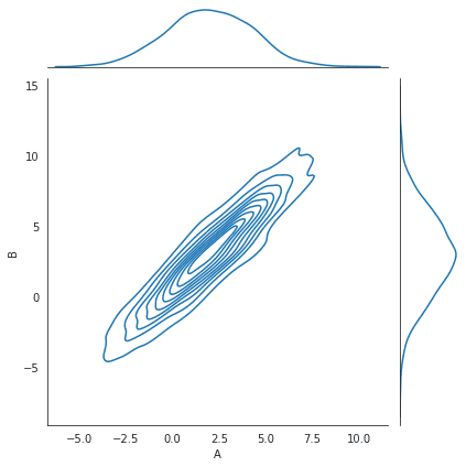
with sns.axes_style('white'):
    sns.jointplot("A", "B", data, kind="hex")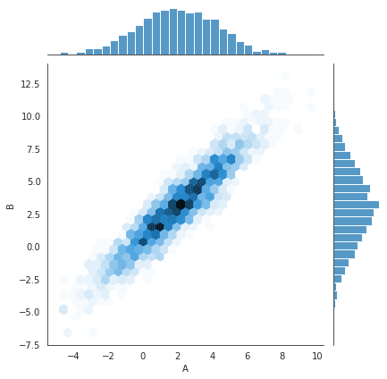
Pairplot
Let’s use the planets dataset from Seaborn Library for rendering multiple plots in a single image. Using pair plots will help in understanding paired relations among multiple variables.
planets = sns.load_dataset("planets")
planets.head()| method | number | orbital period | mass | distance | year | |
|---|---|---|---|---|---|---|
| Radial Velocity | 1 | 269.300 | 7.10 | 77.40 | 2006 | |
| Radial Velocity | 1 | 874.774 | 2.21 | 56.95 | 2008 | |
| Radial Velocity | 1 | 763.000 | 2.60 | 19.84 | 2011 | |
| Radial Velocity | 1 | 326.030 | 19.40 | 110.62 | 2007 | |
| Radial Velocity | 1 | 516.220 | 10.50 | 119.47 | 2009 |
sns.pairplot(planets, hue='year', size=2.5);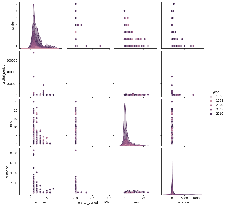
Jointplot
In a joint plot, we get a bivariate graph and two separate graphs placed on their respective axis to show each variable’s distribution plotted with histograms.
In total, you get three graphs,
- one that shows the relationship between variables
- Other two represent variables individually.
aplanets=sns.load_dataset('geyser')
sns.jointplot("duration", "waiting", data=planets, kind='reg')
kind parameter
We can change the kind parameter and use different arguments in the joint plot. To show an example, we will use the ‘hex’ argument with kind.
geyser=sns.load_dataset('geyser')
with sns.axes_style('white'):
    sns.jointplot("duration", "waiting", data=geyser, kind='hex')
Factor Plot
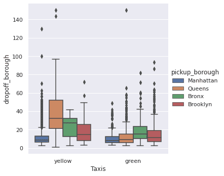
For factor plots, we will use the taxis dataset, which has multivariate data and also has several data types. This dataset was originally published by the NYC Taxi and Limousine Commission (TLC)
taxis = sns.load_dataset('taxis')
taxis.head(5)| Pickup | Drop-Off | Passengers | Distance | Fare | Tip | Tolls | Total | Color | Payment | Pickup_Zone | Dropoff_Zone | Pickup_Borough | dropoff_borough |
|---|---|---|---|---|---|---|---|---|---|---|---|---|---|
| 3/23/2019 20:21 | 3/23/2019 20:27 | 1 | 1.6 | 7 | 2.15 | 0 | 12.95 | yellow | credit card | Lenox Hill West | UN/Turtle Bay South | Manhattan | Manhattan |
| 3/4/2019 16:11 | 3/4/2019 16:19 | 1 | 0.79 | 5 | 0 | 0 | 9.3 | yellow | cash | Upper West Side South | Upper West Side South | Manhattan | Manhattan |
| 3/27/2019 17:53 | 3/27/2019 18:00 | 1 | 1.37 | 7.5 | 2.36 | 0 | 14.16 | yellow | credit card | Alphabet City | West Village | Manhattan | Manhattan |
| 3/10/2019 01:23 | 3/10/2019 01:49 | 1 | 7.7 | 27 | 6.15 | 0 | 36.95 | yellow | credit card | Hudson Sq | Yorkville West | Manhattan | Manhattan |
| 3/30/2019 13:27 | 3/30/2019 13:37 | 3 | 2.16 | 9 | 1.1 | 0 | 13.4 | yellow | credit card | Midtown East | Yorkville West | Manhattan | Manhattan |
with sns.axes_style(style='ticks'):
    g=sns.set(rc={'figure.figsize':(11.7,8.27)})
    g = sns.factorplot("color", "fare", "pickup_borough", data=taxis, kind="box")

    g.set_axis_labels("Taxis", "dropoff_borough");
Time Series Analysis
To understand time series analysis, we are using the worldwide life expectancy dataset. The first plot shows the world GDP over the years and its increase.
lifeexp=sns.load_dataset('healthexp')
lifeexp.head(1)| Year | Country | Spending Usd | Life Expectancy |
|---|---|---|---|
| 1970 | Germany | 252.311 | 70.6 |
with sns.axes_style('white'):
    g = sns.factorplot(x="Year",y="Spending_USD" ,data=lifeexp,aspect=4.0,)
    g.set_xticklabels(step=5)
with sns.axes_style('white'):

    g = sns.factorplot(x="Year",y="Life_Expectancy" ,data=lifeexp ,aspect=2.0,)
    g.set_xticklabels(step=5)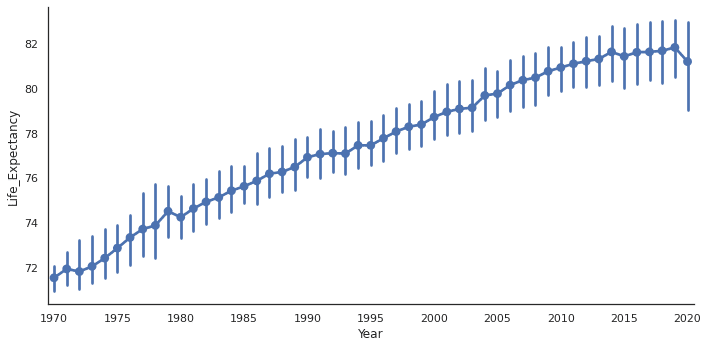
ANCOVA: Analysis of Covariance with python
ANCOVA is an extension of ANOVA (Analysis of Variance) that combines blocks of regression analysis and ANOVA. Which makes it Analysis of Covariance.
Learn Python The Fun Way
What if we learn topics in a desirable way!! What if we learn to write Python codes from gamers data !!
Meet the most efficient and intelligent AI assistant : NotebookLM
Start using NotebookLM today and embark on a smarter, more efficient learning journey!
Break the ice
This can be a super guide for you to start and excel in your data science career.
SQL CRUD basics in 5 mins
Learn SQL CRUD basics and Here’s a fast overview of how to utilize them in 5 minutes.
Important SQL functions
This article will introduce important functions in SQL rank, denserank, over, partition.
Important queries in SQL
In SQL you can make queries in number of ways ,though we can break complex codes into small readable and calculated parts.
SQL for data science
SQL offers several powerful analytical functions that can provide valuable insights
SQL Analytic Functions
SQL’s analytic functions allow for complex calculations and deeper data insights
SQL’s window function
SQL’s window functions are a potent tool that enables you to perform
SQL’s Recursive Common Table Expressions
SQL has a powerful feature called Recursive Common Table Expressions (CTEs), enabling you to work with hierarchical or recursive data. When handling data structures such as organisational hierarchies, bills of materials, family trees, and other similar structures, they can prove extremely valuable. 1. What is a Recursive CTE? 2. Syntax of a Recursive CTE 3.…
SQL stats and maths functions
Statistical and mathematical functions in SQL
Efficient Python 1: Play with Numpy, loops, Lists, Arrays
solve these Efficient python code quizzes
Efficient Python 2
This is the second segment of simple to advanced codes
One response to “Basic plots with Seaborn”
[…] Seaborn is a Python data visualization library based on Matplotlib. See how to use basic plots with seaborn here. […]
Points You Earned


Leave a Reply
You must be logged in to post a comment.