The Matplotlib library helps you create static and dynamic visualisations. Dynamic visualizations that are animated and interactive. This library makes it easy to plot data and create graphs.
Matplotlib in python

The Matplotlib library helps you create static and dynamic visualizations. Dynamic visualizations that are animated and interactive. This library makes it easy to plot data and create graphs.
install and Import Library
import matplotlib# install
Install.packages("ggplot2")
# Load package
library("ggplot2")Import specific method from matplotlib
import matplotlib.pyplot as pltLine plot
Let’s use the plot function, for which we provide two columns from datasets.
import matplotlib.pyplot as plt
# import data preparation library
import numpy as np
# data handling library
import pandas as pd


bill=[25,30,40,50,70,85,95]
tips=[4,6,6.5,7,8.5,9.3,10.8]

print(len(bill),len(tips))
plt.plot(bill,tips)
plt.title('Bill To Tip Ratio')
plt.ylabel('Tips')
plt.xlabel('Bills')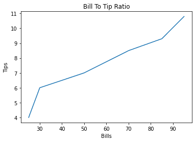
# Load package
library("ggplot2")

df<- data.frame(bill=c(25,30,40,50,70,85,95),tips=(4,6,6.5,7,8.5,9.3,10.8))

library(ggplot2)
# Line plot
ggplot(data=df, aes(x=bill, y=tips, group=1)) + geom_line() + geom_point()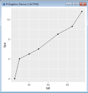
Bar Plot
Bar plot represent data similar to rectangular bars. That are Normalized by a factor to be represented in a graph. Each bar represents a individual value or variable provided.
import matplotlib.pyplot as plt
from matplotlib import style
import pandas as pd
import numpy as np

figure,axes=plt.subplots(1,1)
employees=np.array([20,50,8,100])
axes.hist(employees,bins='auto')
axes.set_title('Histogram')
axes.set_xlabel('Count')
axes.set_ylabel('Employees')
plt.show()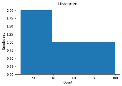
library("ggplot2")
df<-data.frame(Department=c('Finance','Manager','Executive'),Employees=c(20,50,8))
ggplot(data=df,aes(x=Department,y=Employees))+geom_bar(stat='identity')
Histogram
Histograms are similar to graphs. They group variables or classes to represent data in a rectangular bar. These bars are also called as bin.
import matplotlib.pyplot as plt
from matplotlib import style
import pandas as pd
import numpy as np

figure,axes=plt.subplots(1,1)
employees=np.array([20,50,8,100])
axes.hist(employees,bins='auto')
axes.set_title('Histogram')
axes.set_xlabel('Count')
axes.set_ylabel('Employees')
plt.show()
library("ggplot2")
df<-c(20,50,8,100)
hist(df,xlab="Employee count",col="green",border="black")
Scatter plot
Scatter plot points out the exact placement of a data point. Using scatter plots, we can find clustered data. We can also use a third variable to change the size of the circle. It will add a third dimension to the graph.
import matplotlib.pyplot as plt
from matplotlib import style
import pandas as pd
import numpy as np

Department=['Finance','Manager','Executive','Worker']
employees=[20,50,8,100]
salary=[75,165,469,25]
figure=plt.figure()
axes=figure.add_axes([0,0,1,1])

axes.scatter(Department,employees,color='b')
axes.set_xlabel('Department')
axes.set_ylabel('Employees')
axes.set_title('Scatter_plot')
plt.show()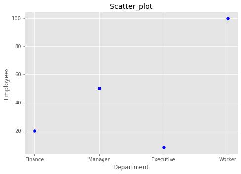
library("ggplot2")
df<-data.frame(Department=c('Finance','Manager','Executive','Worker'),Employees=c(20,50,8,100),salary=c(75,165,469,25))
ggplot(df,aes(x=Department,y=Employees))+geom_point(size=2,shape=46)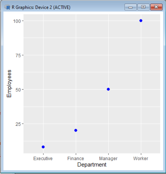
In the following code, we used the third variable, salary, to differentiate data points from each other.
import matplotlib.pyplot as plt
from matplotlib import style
import pandas as pd
import numpy as np

Department=['Finance','Manager','Executive','Worker']
employees=[20,50,8,100]
salary=[75,165,469,25]
figure=plt.figure()
axes=figure.add_axes([0,0,1,1])

axes.scatter(Department,employees,salary,color='b')
axes.set_xlabel('Department')
axes.set_ylabel('Employees')
axes.set_title('Scatter_plot')
plt.show()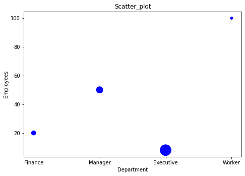
library("ggplot2")
df<-data.frame(Department=c('Finance','Manager','Executive'),Employees=c(20,50,8),salary=c(75,165,469,25))


ggplot(df, aes(x=Employees, y=salary, shape=salary, color=Department)) +
  geom_point()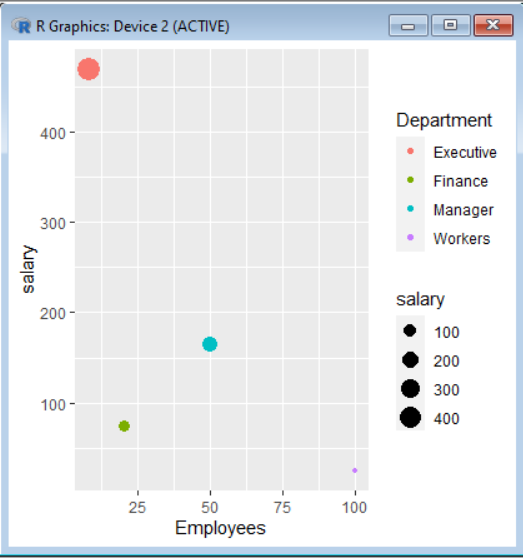
Sub Plots
There is a concept of subplots in Matplotlib where we can create a grid of plots. The grid can organise plots.
import matplotlib.pyplot as plt
from matplotlib import style
import pandas as pd
import numpy as np

Department=['Finance','Manager','Executive','Worker']
employees=[20,50,8,100]
salary=[75,165,469,25]

plt.subplot(1,2,2)

plt.bar(Department,salary,width=0.5)
plt.xlabel("Department")
plt.ylabel("Salary")

plt.subplot(1,2,2)
figure=plt.figure()
axes=figure.add_axes([0,0,1,1])

axes.scatter(Department,employees,salary,color='b')
axes.set_xlabel('Department')
axes.set_ylabel('Employees')
axes.set_title('Scatter_plot')

plt.show()

library("ggplot2")
df<-data.frame(Department=c('Finance','Manager','Executive','Worker'),Employees=c(20,50,8,100),salary=c(75,165,469,25))

ggplot(data=df,aes(x=Department,y=Employees))+geom_bar(stat='identity')
ggplot(df, aes(x=Employees, y=salary, shape=salary, color=Department))+geom_point()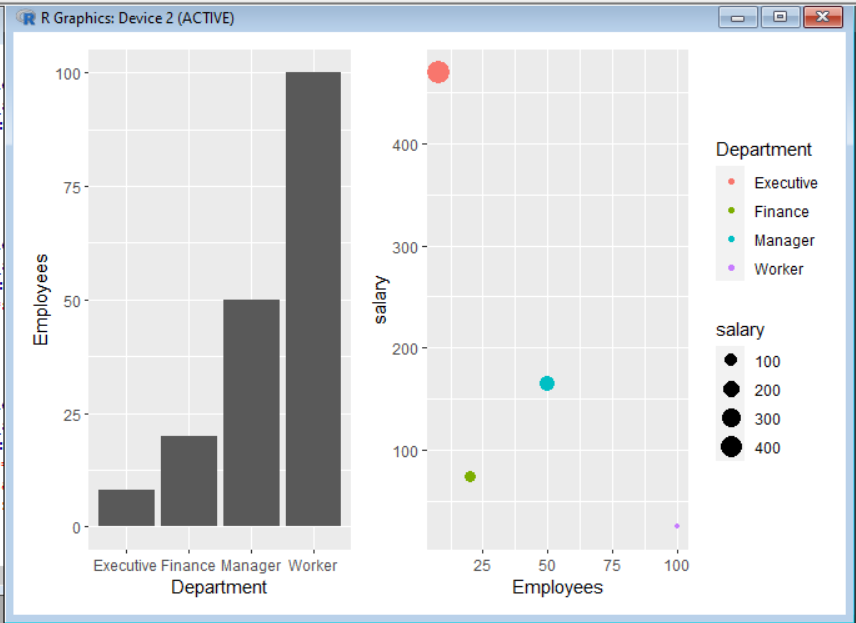
Time Series Data Plot
We have saved the stock data in the nested dictionaries. Here we plot accurate data points with plt.plot() and plt.scatter(). By using these, we create connected scatter plots. Using the following method, you can mix multiple types of plots into a single graph.
# load libraries
import matplotlib.pyplot as plt
from matplotlib import style
import pandas as pd
import numpy as np

# create dataset
Stocks=pd.DataFrame({'Year':[2022,2021,2020,2019,2018],'Motors_Turnover':[47263.68,47031.47,43928.17,69202.76,58831.41],'Steel_Turnover':[129021.35,64869.00,60435.97,70610.92,59160.79]})

# plot multiple lines in one plot
plt.plot(Stocks['Year'],Stocks['Motors_Turnover'],label="Tata Motors",color='r')
plt.scatter(Stocks['Year'],Stocks['Motors_Turnover'], color='r')
plt.plot(Stocks['Year'],Stocks['Steel_Turnover'],label="Steel Motors",color='b')
plt.scatter(Stocks['Year'],Stocks['Steel_Turnover'],color='b')
plt.legend()
plt.xlabel('Years')
plt.ylabel('Net TurnOver (Crores)')
plt.title('Information')
plt.show() 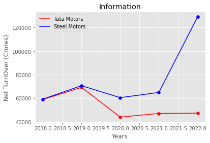
# Load library
library("ggplot2")
# load dataset
stock<-data.frame(Year=c(2022,2021,2020,2019,2018),Motors_Turnover=c(47263.68,47031.47,43928.17,69202.76,58831.410),Steel_Turnover=c(129021.35,64869.00,60435.97,70610.92,59160.79))
# Save two plots in stock_plot
stock_plot<- ggplot(stock, aes(Year))+geom_line(aes(y=Motors_Turnover),color = "green") + geom_line(aes(y = Steel_Turnover), color = "blue")
stock_plot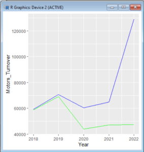
ANCOVA: Analysis of Covariance with python
ANCOVA is an extension of ANOVA (Analysis of Variance) that combines blocks of regression analysis and ANOVA. Which makes it Analysis of Covariance.
Learn Python The Fun Way
What if we learn topics in a desirable way!! What if we learn to write Python codes from gamers data !!
Meet the most efficient and intelligent AI assistant : NotebookLM
Start using NotebookLM today and embark on a smarter, more efficient learning journey!
Break the ice
This can be a super guide for you to start and excel in your data science career.
SQL CRUD basics in 5 mins
Learn SQL CRUD basics and Here’s a fast overview of how to utilize them in 5 minutes.
Important SQL functions
This article will introduce important functions in SQL rank, denserank, over, partition.
Important queries in SQL
In SQL you can make queries in number of ways ,though we can break complex codes into small readable and calculated parts.
SQL for data science
SQL offers several powerful analytical functions that can provide valuable insights
SQL Analytic Functions
SQL’s analytic functions allow for complex calculations and deeper data insights
SQL’s window function
SQL’s window functions are a potent tool that enables you to perform
SQL’s Recursive Common Table Expressions
SQL has a powerful feature called Recursive Common Table Expressions (CTEs), enabling you to work with hierarchical or recursive data. When handling data structures such as organisational hierarchies, bills of materials, family trees, and other similar structures, they can prove extremely valuable. 1. What is a Recursive CTE? 2. Syntax of a Recursive CTE 3.…
SQL stats and maths functions
Statistical and mathematical functions in SQL
Efficient Python 1: Play with Numpy, loops, Lists, Arrays
solve these Efficient python code quizzes
Efficient Python 2
This is the second segment of simple to advanced codes
One response to “Matplotlib in python”
[…] Matplotlib is a plotting library for the Python programming language and its numerical mathematics extension NumPy. Gain further knowledge from our following article. […]
Points You Earned


Leave a Reply
You must be logged in to post a comment.