This library is named Plotly after the company of the same name. Plotly provides visualization libraries for Python, R, MATLAB, Perl, Julia, Arduino, and REST.
Plotly with Python and R

This library is named Plotly after the company of the same name. Plotly provides visualization libraries for Python, R, MATLAB, Perl, Julia, Arduino, and REST.
Installation
Install the library in the command prompt if on the system, or you can directly run and install the command in a cell if you are using Google Colab or Jupyter Lab.
!pip install plotlyinstall.packages('plotly')Importing Plotly
Syntax for importing plotly.
# direct import
import plotly
# specific import
import plotly.express as pxlibrary(plotly)Well, we understood the installation and importing parts, now let’s learn how to use the library to carry out your visualizations.
Data:
| Experience | Salary(In Lacks) |
|---|---|
| 1 | 4 |
| 2 | 6 |
| 3 | 9 |
| 4 | 12 |
Observe the data sample above. We have two columns. First are years of experience, and second is salary. Salary is dependent on experience.
import plotly.express as px

# provide data to line plot function in px.line
fig=px.line(x=[1,2,3,4],y=[4,6,9,12])

# plot the line
fig.show()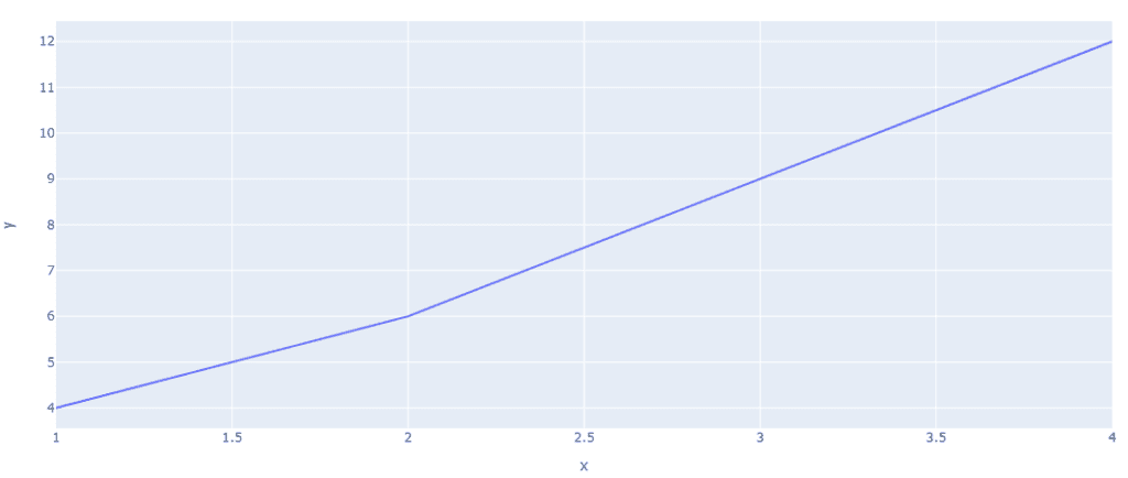
library(plotly)
data_line <- data.frame(x=c(1,2,3,4),y=c(4,6,9,12))
fig <- plot_ly(data_line, x = ~x, y = ~y, mode = 'lines')
Line plots with the Iris dataset in line plot px. The line represents the vertices of each data point.
# import plotly express library
import plotly.express as px

# Load the stocks dataset
df = px.data.stocks()

# plotting the line chart
fig = px.line(df, x="date", y="GOOG")

# showing the plot
fig.show()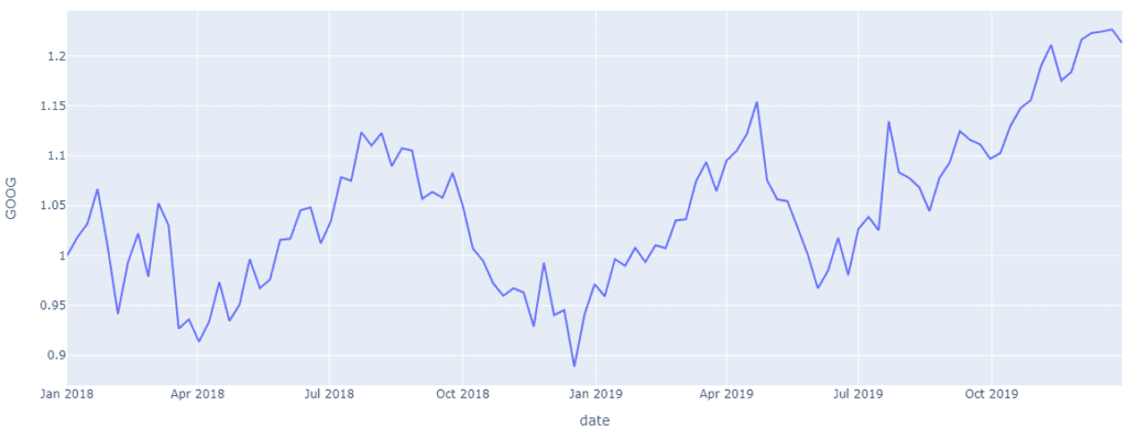
# import plotly express library
import plotly.express as px

# Load the stocks dataset
df = px.data.stocks()

# plotting the line chart
fig = px.line(df, x="date", y="GOOG")

# showing the plot
fig.show()
Bar Chart
Bar charts represent data in the form of rectangular blocks; they aggregate all the data points from a dataset’s columns into individual bars. In the example below, we have used election data from the 2013 Montreal mayoral election. This dataset is provided by the Plotly library. Bar graphs represent categorical data in a graphical structure.
import plotly.express as px

# using the Election dataset
df = px.data.election()

# plotting the bar chart
fig = px.bar(df, y="total", x="winner")

# showing the plot
fig.show()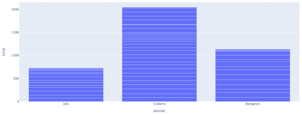
library(plotly)
elect <- read.csv('https://raw.githubusercontent.com/plotly/datasets/master/election.csv')

fig <- plot_ly(elect,
  y = ~total,
  x = ~winner,
  name = "Winner Data",
  type = "bar"
)

fig
You can segregate the data even further by using the colour argument in bar(). In the following plot, we will segregate the win count by majority and plurality wins.
import plotly.express as px

# Load the Election dataset
df = px.data.election()

# plotting the bar chart
fig = px.bar(df, y="total", x="winner",color='result')

# showing the plot
fig.show()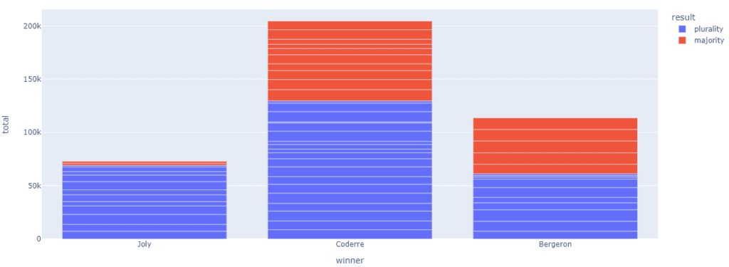
library(plotly)
elect <- read.csv('https://raw.githubusercontent.com/plotly/datasets/master/election.csv')

fig <- plot_ly(elect,
  y = ~total,
  x = ~winner,
  name = "Winner Data",
  type = "bar"
)

fig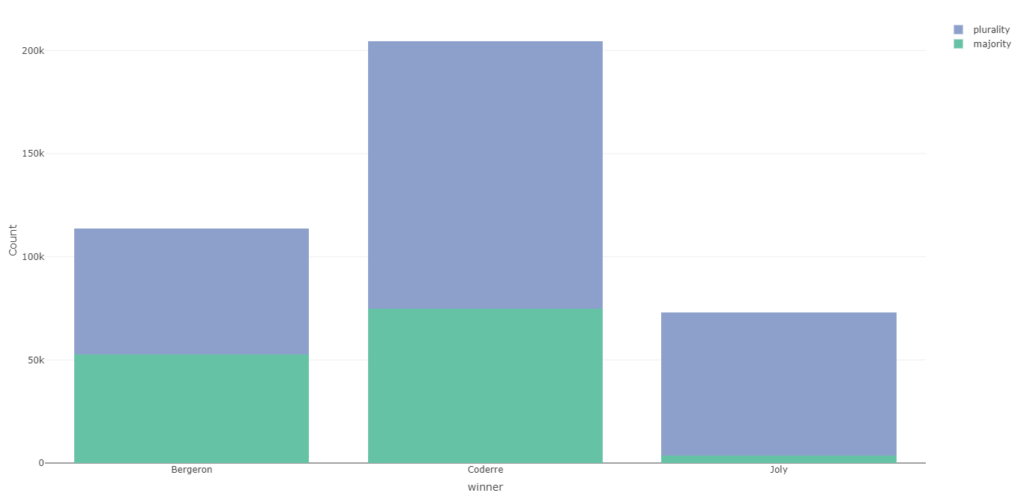
Histogram
Histograms represent quantitative data in a graphical structure. Using histograms, we show the frequency of numerical data. We can represent the distribution of data in histograms.
import plotly.express as px

# Load the Election dataset
df = px.data.election()

# plotting the histogram
fig = px.histogram(df, y="total", x="winner",color='result')

# showing the plot
fig.show()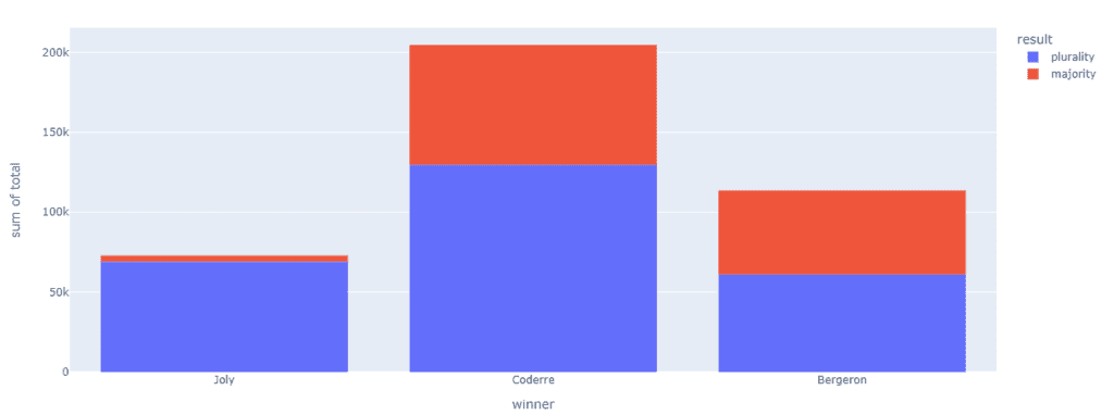
library(plotly)
elect <- read.csv('https://raw.githubusercontent.com/plotly/datasets/master/election.csv')
fig <- plot_ly(elect,type='histogram',x=~winner,color=~result,bingroup=1,barmode='stacked')
fig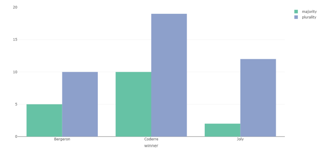
Scatter Plot
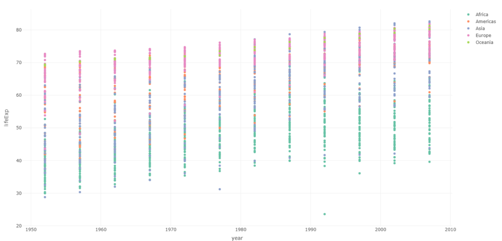
A sample scatter plot can be studied here when we plot time against the y-axis. And life expectancy in years against x, and the colour plots differentiate between continents.
import plotly.express as px

# using the world GDP dataset
df = px.data.gapminder()

# plotting the scatter chart
fig = px.scatter(df, x="year", y="lifeExp",color='continent')

# showing the plot
fig.show()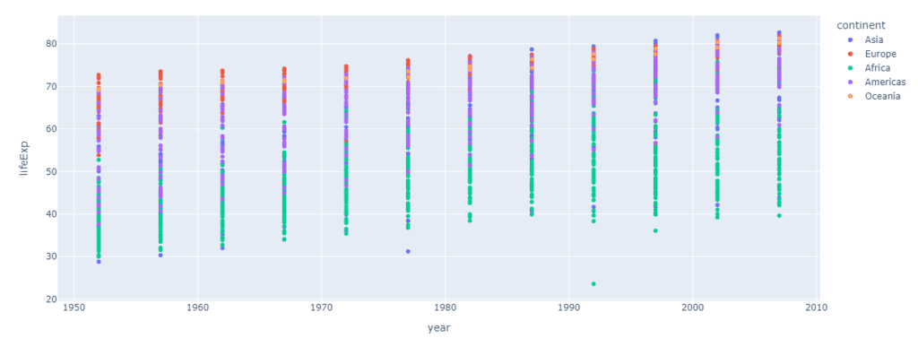
library(plotly)
gapminder<-read.csv('https://raw.githubusercontent.com/plotly/datasets/master/gapminderDataFiveYear.csv')

fig<-plot_ly(data=gapminder,x=~year,y=~lifeExp,color=~continent)
fig
Pie Chart
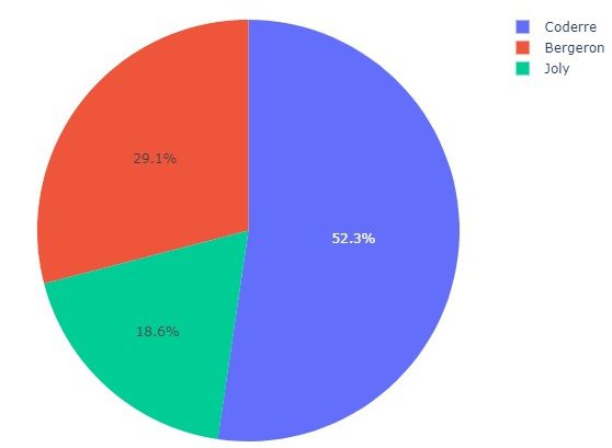
The distribution of votes each contender got can be easily observed in the given pie chart.
import plotly.express as px

# using the Election dataset
df = px.data.election()

# plotting the pie chart
fig = px.pie(df, values="total", names="winner",title='District wins Distribution')

# showing the plot
fig.show()
elect <- read.csv('https://raw.githubusercontent.com/plotly/datasets/master/election.csv')
library(plotly)
fig <- plot_ly(elect,type='pie', labels=~winner, values=~total,textinfo='label+percent',insidetextorientation='radial')
fig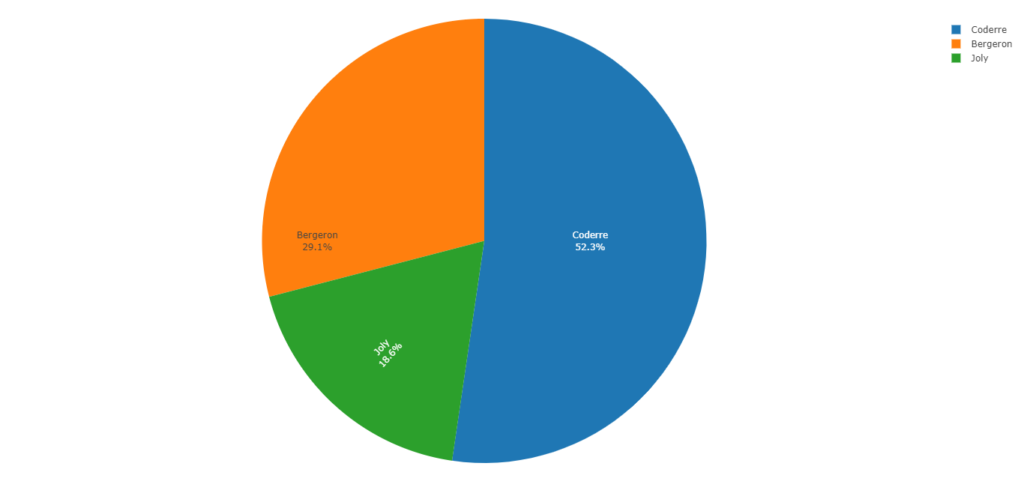
Violin plot
We can see the peaks in the given plot, which is a combination of box and kernel density plots.
import plotly.express as px

# using the tips dataset
df = px.data.election()

# plotting the violin chart
fig = px.violin(df, x="winner", y="total")

# showing the plot
fig.show()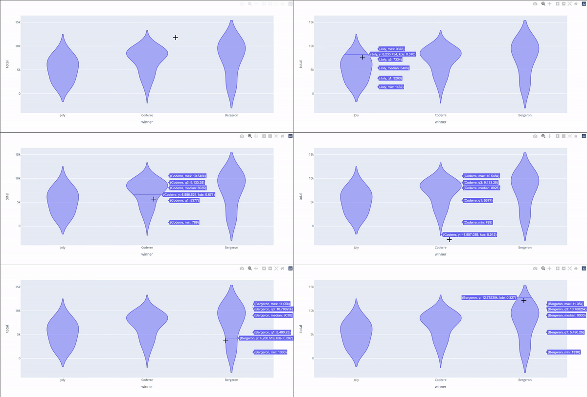
library(plotly)
elect <- read.csv('https://raw.githubusercontent.com/plotly/datasets/master/election.csv')

fig <- elect %>%
plot_ly(x = ~winner,
	  y = ~total,
        split = ~winner,
        type = 'violin',
        meanline = list(
        visible = T
        )
        )

fig <- fig %>%
  layout(
    xaxis = list(
      title = "Winner"
    ),
    yaxis = list(
      title = "winner",
      zeroline = F
    )
  )
fig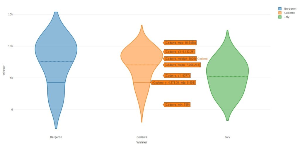
Box plot
Skew and variance of these three groups can be seen in the given below box plot.
import plotly.express as px

# using the election dataset
df = px.data.election()

# plotting the box plot
fig = px.box(df, x="winner", y="total")

# showing the plot
fig.show()
library(plotly)
elect <- read.csv('https://raw.githubusercontent.com/plotly/datasets/master/election.csv')
fig <- plot_ly(elect, y = ~total, color = ~winner, type = "box")
fig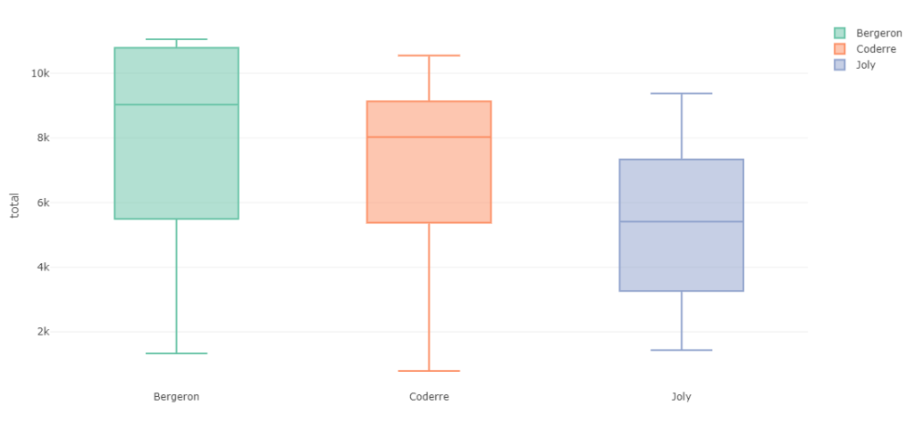
Gantt Chart
Gantt charts are used to show the progression of an activity against time.
import plotly.figure_factory as ff
import pandas as pd
# Data to be plotted
df = pd.DataFrame([
    dict(Task="Back-End", Start='2022-01-01', Finish='2022-04-28', Resource="Steve"),
    dict(Task="User-InterFace", Start='2022-01-01', Finish='2022-03-10', Resource="Elon"),
    dict(Task="Patch", Start='2022-04-20', Finish='2022-05-15', Resource="Mark"),

])

# Creating the plot
fig = ff.create_gantt(df)
fig.show()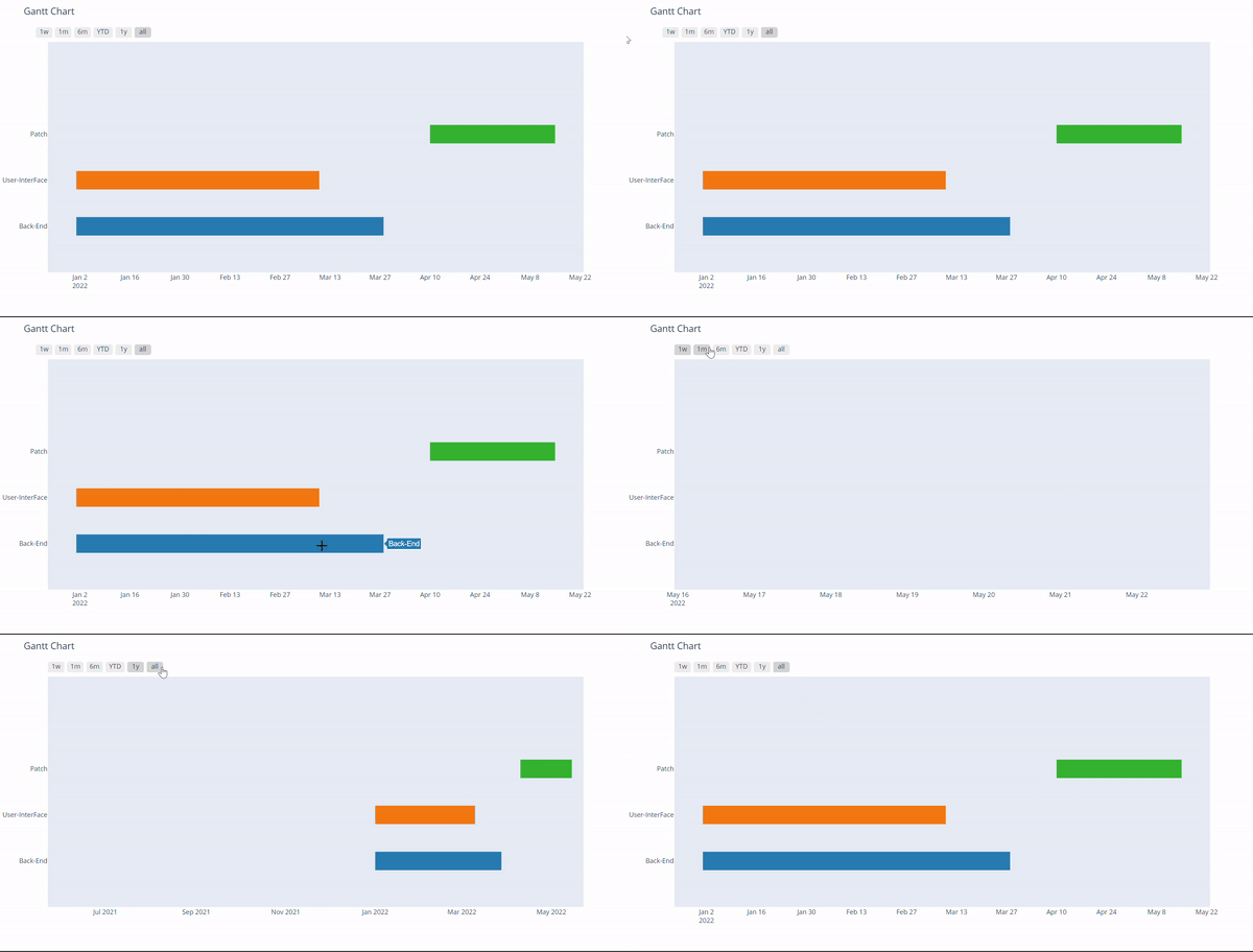
install.packages('rehape2')
library(plotly)
library(reshape2)
require(ggplot2)

tasks <- c("Back-End", "User-Interface",
           "Middleware")

# Compile dataframe of task names, and respective start and end dates.
dfr <- data.frame(name = tasks,
  start.date=as.Date(c("2022-01-01","2022-01-01","2022-04-20")),
  end.date = as.Date(c("2022-4-28","2022-03-10","2022-05-15")),
  resource = c("Steve","Elon","Mark")
)

# Merge start and end dates into durations.
mdfr <- melt(dfr, measure.vars = c("start.date", "end.date"))

p <- ggplot(dfr) +
      geom_linerange(aes(y = name,
                         xmin = start.date,
                         xmax = end.date,
                         colour = as.factor(resource)),
                     size = I(50)) +
      theme_minimal()


ggplotly(p)
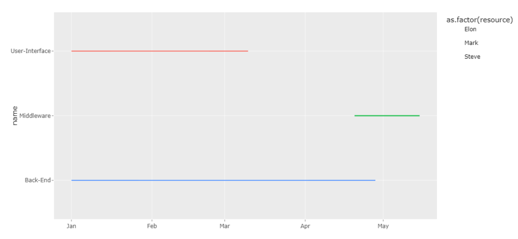
Timeline plot
Timeline charts can display events in chronological order.
import plotly.figure_factory as ff
import pandas as pd
# Data to be plotted
df = pd.DataFrame([
    dict(Task="Back-End", Start='2022-01-01', Finish='2022-03-28', Emp="Elon"),
    dict(Task="User-InterFace", Start='2022-01-01', Finish='2022-03-10', Emp="Steve"),
    dict(Task="User-InterFace", Start='2022-01-10', Finish='2022-02-25', Emp="Mark"),
    dict(Task="Patch", Start='2022-04-10', Finish='2022-05-15', Emp="Mark")
])

# Creating the plot
fig = px.timeline(df,x_start='Start',x_end='Finish',y='Emp',color='Emp')
fig.show()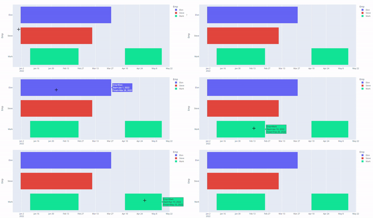
# Install and load the required packages
if (!require("plotly")) {
  install.packages("plotly")
}
library(plotly)

# Load the data
df <- data.frame(
  Task = c("Back-End", "User-InterFace", "User-InterFace", "Patch"),
  Start = as.Date(c("2022-01-01", "2022-01-01", "2022-01-10", "2022-04-10")),
  Finish = as.Date(c("2022-03-28", "2022-03-10", "2022-02-25", "2022-05-15")),
  Emp = c("Elon", "Steve", "Mark", "Mark")
)

# Create the plot
fig <- plot_ly(data = df, x = ~Start, xend = ~Finish, y = ~Emp, type = "scatter", mode = "lines",
               line = list(color = "blue", width = 6)) %>%
  layout(title = "Task Timeline",
         xaxis = list(title = "Timeline"),
         yaxis = list(title = "Employee"),
         showlegend = FALSE)

# Show the plot
fig

Quiver Plot
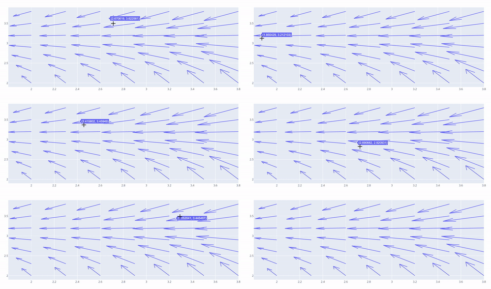
These plots show vector lines as arrows. To show for example electrical potential
import plotly.graph_objects as go
import numpy as np

# Creating the X, Y value that will
# change the values of Z as a function
x,y = np.meshgrid(np.arange(2, 4, .3), np.arange(2, 4, .3))
u = np.cos(y)*x
v = np.sin(y)*x

fig = ff.create_quiver(x, y, u, v)
fig.show()
library(plotly)

df <- expand.grid(x = 1:20, y=1:20)
df$angle <- runif(100, 0, 2*3.14)
df$speed <- runif(100, 0, sqrt(df$x))

p <- ggplot(df, aes(x, y)) +
  geom_point() +
  geom_spoke(aes(angle = angle, radius = speed))

fig <- ggplotly(p)

fig

Heatmap
Heatmap visualisations show represent the data magnitude in the form of colour. More magnitude means darker colours.
import plotly.graph_objects as go

feature_x = np.arange(0, 100, 2)
feature_y = np.arange(0, 100, 3)

# Creating 2-D grid of features
[X, Y] = np.meshgrid(feature_x, feature_y)

Z = np.cos(X / 2) + np.sin(Y / 4)

# plotting the figure
fig = go.Figure(data =
     go.Heatmap(x = feature_x, y = feature_y, z = Z,))

fig.show()
library(plotly)
fig <- plot_ly(z=~volcano,type = "heatmap") %>%
    layout(margin = list(l=120))

fig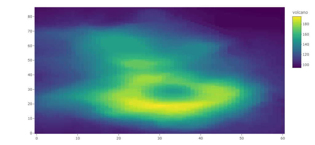
ANCOVA: Analysis of Covariance with python
ANCOVA is an extension of ANOVA (Analysis of Variance) that combines blocks of regression analysis and ANOVA. Which makes it Analysis of Covariance.
Learn Python The Fun Way
What if we learn topics in a desirable way!! What if we learn to write Python codes from gamers data !!
Meet the most efficient and intelligent AI assistant : NotebookLM
Start using NotebookLM today and embark on a smarter, more efficient learning journey!
Break the ice
This can be a super guide for you to start and excel in your data science career.
Model Context Protocol (MCP) — the “USB” for AI tools
MCP is the USB port for AI — A standard that lets models like ChatGPT safely connect to tools and servic
Manova Quiz
Solve this quiz for testing Manova Basics
Quiz on Group By
Test your knowledge on pandas groupby with this quiz
Visualization Quiz
Observe the dataset and try to solve the Visualization quiz on it
Versions of ANCOVA (Analysis Of Covariance) with python
To perform ANCOVA (Analysis of Covariance) with a dataset that includes multiple types of variables, you’ll need to ensure your dependent variable is continuous, and you can include categorical variables as factors. Below is an example using the statsmodels library in Python: Mock Dataset Let’s create a dataset with a mix of variable types: Performing…
Python Variables
How useful was this post? Click on a star to rate it! Submit Rating
A/B Testing Quiz
Complete the code by dragging and dropping the correct functions
Python Functions
Python functions are a vital concept in programming which enables you to group and define a collection of instructions. This makes your code more organized, modular, and easier to understand and maintain. Defining a Function: In Python, you can define a function via the def keyword, followed by the function name, any parameters wrapped in parentheses,…
Python Indexing: A Guide for Data Science Beginners
Mastering indexing will significantly boost your data manipulation and analysis skills, a crucial step in your data science journey.
Points You Earned


Leave a Reply
You must be logged in to post a comment.